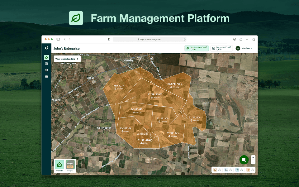
Farm Management Platform
This project was for an Australian farm management service, allowing land owners to understand how their soil carbon changes over time and ways to lessen their CO2 emissions. Continue reading below to see my journey after working on this project for 1 and 1/2 years.
Brand Identity and Product Structure
First off was identifying the brand style that we will be using throughout the project's duration. After providing a couple of identities and color styles, we agreed upon using greens as the main color swatch, Lato for type, and outlined icons.
An important question to ask it how would users interact with the features of this platform? To answer this, I created a high-level experience map (HLEM), addressing user groups, their main actions, and goals. See below the brand identity and HLEM.
1.5. Design System
Alongside this, we also set up a proper design system in Figma, utilising both styles and variables. We used the Atomic Design structure formulated by Brad Frost, allowing us to set up the system for success and future-proof.
Next up, we discussed the application of the platform's main features, user pain points, and ideas for improvement. To better visualise these, I created a few iterations of wireframes. A major point of the decision was to ensure the dashboard remains map-centric. We had a few back-and-forths, but eventually settled with a solid layout for the screen.
We then moved on to hi-fi designs based on the layout we locked in in the previous phase. The nitty-gritty of these features come from separate design briefs outlining specific users, main goals they want to achieve, edge cases, and other details.
A huge challenge was making sure all necessary data is clearly visible to the user (depending on the user group). To solve this, I prioritised clear information hierarchy for the most important parts of a feature. An example would be a summary of the farm state in high contrast and placed relatively high in the panel.
See the dashboard and a few of the specific modules of the platform below:
Users might react using a feature in very different ways. After implementation of the map-centric dashboard and its sub-modules, we provided a full platform review every 2 weeks using FullStory. In it, I investigated the user trends, interactivity, friction, and errors encountered over the past month.
This allowed the client to see areas to improve, which will drive future design developments and increase user retention of the platform.
© 2026
All Rights Reserved